Building interface previews with React
Deep dive into building skeleton loading elements using React, whilst introducing Preact.js.
-
Published
-
Categories
Since my last post I've been experimenting with different ways interface previews can be implemented. For the purpose of this post I'll use React because a) its amazing and b) the underlying principles I cover can be applied to other JS frameworks with relative ease.
Refining the implementation #
Conditional templates #
Initially I thought the cleanest approach was separating placeholder elements from the real ones. For example this interface:
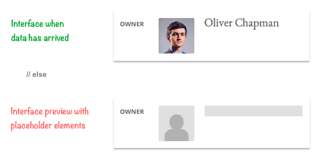
Would have the following code:
Programming language (abbreviated): js
render: function() {
  return (
    <div>
      <strong>Owner</strong>

      { this.state.data_arrived ? (
        <div>
          <img src={this.data.user.profile_pic}>
          <p>{this.data.user.name}</p>
        </div>
      ) : (
        <div>
          <span className="image-preview"></span>
          <span className="text-preview"></span>
        </div>
      ) }
    </div>
  );
}
this.state.data_arrived is a state variable initially set to false and then set to true once data from the server has arrived.
The principles behind this are good:
- Separation of concerns (inside templates)
- Can disable interactions (stop buttons / form elements from being used before page is ready)
However templates get bloated as they contain two sets of mark up - one for their preview state and one for when the data they show has arrived. Having used interface previews more and more I realized there must be a smarter method of showing placeholder elements. In an ideal world there needed to be one template without any conditional logic inside it, which contained only one set of elements. This meant elements needed to become declarative.
Declarative elements #
In terms of interface previews declarative elements should only have one set of mark up. The same mark up should be used whilst the element is waiting for its data and when it's data has arrived.
Previously I said "the structure of the element is generally different for its two states". However I've found increasingly that this isn't the case. The structure of elements and how they are positioned is always the same; its the values they show that are different.
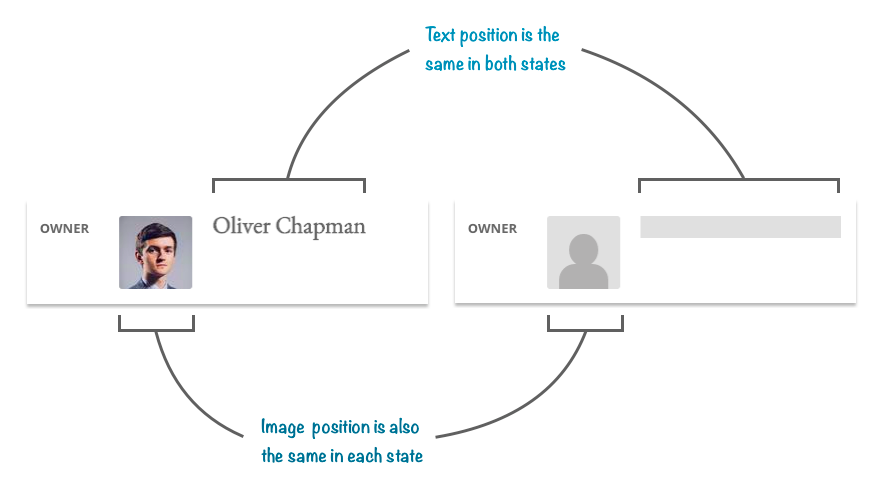
Here we can see the profile image always sits to the left of the persons name. As each layout is the same it would be nice if both shared the same mark up. This is where declarative elements come into play. What I really want is to specify an image and a heading in the template once. Something like this:
Programming language (abbreviated): jsx
<div>
  <strong>Owner</strong>
  <img src={this.data.user.profile_pic}>
  <p>{this.data.user.name}</p>
</div>
If the profile image and name aren't available show the placeholder image and placeholder heading in the meantime. The problem with using the snippet above is that this.data is undefined on the initial render (as it wouldn't have arrived from the server yet). If we delay the render until it does arrive we are blocking the UI.
A solution I've nicknamed Preact overcomes this by moving the server dependent props out of the template. Props are assigned to companion variables that are initially declared without values. These variables can be used in the template on the initial render (when they are empty) and on the second render when they contain values. Declaring variables in one place also makes it easier to see what a component will show.
Note: Arrays need to be initialized with an empty array so that operations like .map or .each can be used in the template on the initial render.
For example:
Programming language (abbreviated): jsx
render: function() {
  var profile_pic, name;

  if (this.props.data_arrived) {
    profile_pic = this.data.user.profile_pic;
    name = this.data.user.name;
  }

  return (
    <div>
      <strong>Owner</strong>
      <Image src={profile_pic} />
      <p>{name}</p>
    </div>
  )
}
You'll notice that the image is a React component rather than a HTML image tag - we'll get to this in a bit.
Here we have one template that is rendered when we are waiting for data and again when it has arrived. The templates concern is what it should show, and not how it will show it. We have described what the layout should look like without hard-coding its implementation; hence the term declarative elements.
To give this component a preview we can give it a conditional class whilst its waiting for data. Any elements inside it that wish to have previews can also be given a class.
React provided a utility for this as part of its addons called classSet:
Programming language (abbreviated): jsx
var classSet = React.addons.classSet;

// ...

render: function() {
  var conditional_class = classSet({
    'user waiting-on-data': !this.data.data_arrived,
    'user': this.data.data_arrived,
  });
  var profile_pic, name;

  if (this.props.data_arrived) {
    profile_pic = this.data.user.profile_pic;
    name = this.data.user.name;
  }

  return (
    <div className={conditional_class}>
      <strong>Owner</strong>
      <Image src={profile_pic} />
      <p>{name}</p>
    </div>
  )
}
Here the component will have the class "waiting-on-data" whilst data_arrived is false, which allows us to style anything inside it that has the class "with-preview". Boilerplate styles for element previews can be found here.
Pointer events to the rescue #
We can also add the class "disabled-in-preview" to any elements that a user shouldn't be able to use whilst the component is in its preview state. For example:
Programming language (abbreviated): jsx
<div className={conditional_class}>
  <strong>Owner</strong>
  <Image src={profile_pic} />
  <p>{name}</p>
  <button className="disabled-in-preview" onClick={this.editUser}>
    Edit user
  </button>
</div>
Elements with the class "disabled-in-preview" have their (CSS) hover/active states, and (JS) click/focus/tap events prevented using the highly under-rated CSS property pointer-events. In this example the click event editUser won't register until the "waiting-on-data" class is removed from the parent div. This class can also be used to modify the elements appearance in its disabled state; reducing the opacity usually does the trick.
Image component #
The image component simply returns a placeholder image or an actual image depending on whether src props exists. The width and height are also passed in as props so that the placeholder image is the same size as the actual image. The width and height could alternatively be explicitly set in CSS.
The placeholder image and image sit inside a wrapper with the class "preact-image-mask", so use this when adding your own styles on top of the boilerplate ones.
Interface previews make a debut in CommuSoft #
We have been eagerly anticipating interface previews in Commusoft for a while now, and this week they made their first appearance! They've been used in a new context too - broadening the use cases in which interface previews can be used. (The emphasis till now has always been on page load).
A crucial part of the diary is being able to add events to it quickly. Part of this process is selecting which property the event will take place at. Some users can have up to 60,000 properties, so the search needs some magic to make it feel quick (a.k.a perceived speed).
Here's a sneak peak:
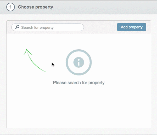
As soon as you begin typing in the search input, placeholder results are shown immediately and remain showing until the results have come back from the server. This greatly reduces the perception of how long it takes to get the list of properties, and if anything spruces up the interface for us.
To conclude #
It would be fair to say I'm still early into my research of finding the best ways of implementing interface previews. In my opinion the Preact approach comes up trumps, as it reduces the complexity in which they can be used; which in turn betters the developer experience. It would be great to get your thoughts & ideas of how the approaches discussed could be refined further.
A demo interface built using the Preact pattern along with source code can be found here.
About the author
I'm Callum, a Front-end Engineer at Nutmeg. Previously I wrote code for KAYAK, American Express, and Dell. Out of hours I publish blog posts (like this one) and tweet cherry-picks.
Feel free to follow or message me at @_callumhart on Twitter.