An Accessible Current Page Navigation State
Design and technical considerations behind the icon that indicates what page you're currently on.
-
Published
-
Categories
Introduction #
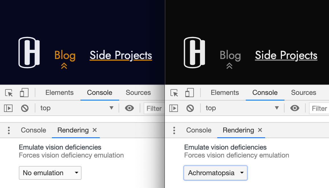
Colour is an effective way to convey meaning on the web. For example, the current page "Blog" on this sites header is highlighted in orange.
The orange colour is accompanied by an icon the double chevron – which is not just a cosmetic detail – but serves a functional purpose to those with low or colour vision deficiencies.
CSS background image #
Originally the double chevron was applied using CSS background image due to the simplicity of positioning it with background-position:
Programming language (abbreviated): css
.site-header a[aria-current='page'] {
  background-image: url('/img/icons/chevron-double-up.svg');
  background-repeat: no-repeat;
  background-position: center bottom;
}
Whilst fulfilling the need to supplement colour with a second visual indicator, using CSS had its disadvantages.
Firstly the icon colour had to be hard coded in the SVG:
Programming language (abbreviated): svg
<svg fill="rgba(206, 128, 5, 1)" ...></svg>This incurred a maintenance cost should the accent colour (currently orange) change in future. It is also less flexible should the icon be consumed in other contexts (that use other colours).
Secondly the background image (being an external resource reliant on a network request) had the risk of the SVG file failing to load.
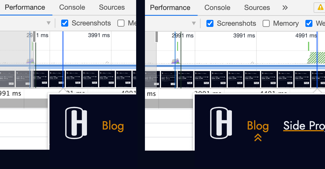
And thirdly slow networks suffered a noticeable lag between displaying the text "Blog" and its accompanying icon:
Inlining the SVG #
Inlining the SVG in the HTML was a better approach that nullified these drawbacks of CSS background image.
Programming language (abbreviated): html
<a href="/blog/" aria-current="page">
  Blog

  <svg
    xmlns="http://www.w3.org/2000/svg"
    fill="currentColor"
    width="1em"
    height="1em"
    viewbox="0 0 24 24"
    aria-hidden="true"
    focusable="false"
  >
    <path
      fill-rule="evenodd"
      d="M4.293 15.707a1 1 0 010-1.414l5-5a1 1 0 011.414 0l5 5a1 1 0 01-1.414 1.414L10 11.414l-4.293 4.293a1 1 0 01-1.414 0zm0-6a1 1 0 010-1.414l5-5a1 1 0 011.414 0l5 5a1 1 0 01-1.414 1.414L10 5.414 5.707 9.707a1 1 0 01-1.414 0z"
      clip-rule="evenodd"
    />
  </svg>
</a>
The hard coded colour could be replaced with fill="currentColor" giving CSS full control of the SVG colour in this and other contexts.
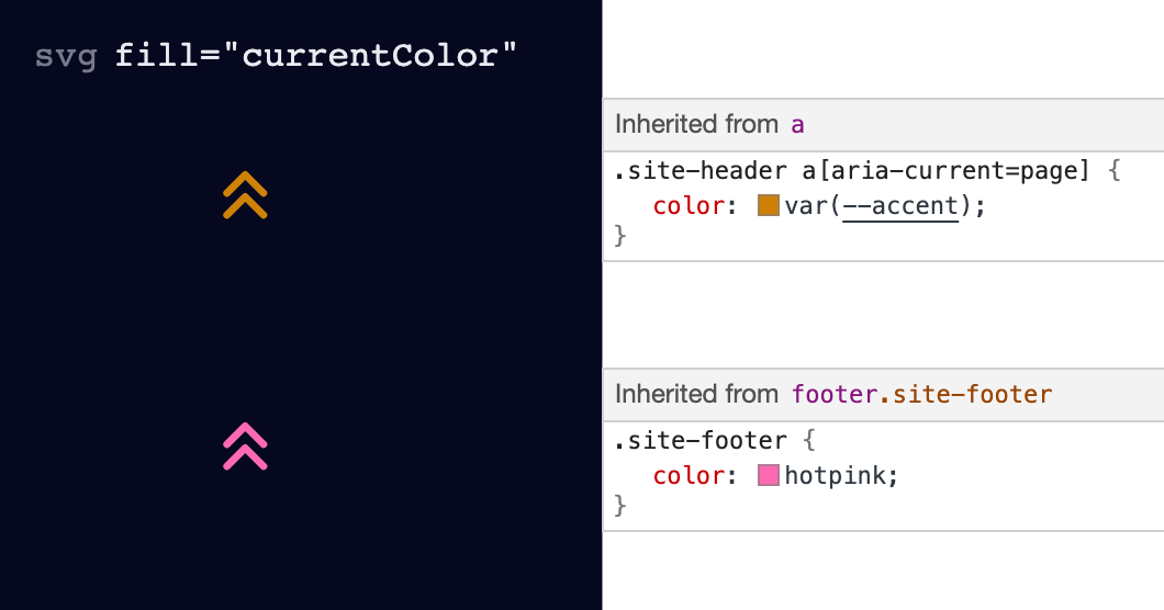
fill="currentColor" allows an SVG to inherit its colour from the surrounding context.
Eliminating the network request (by inlining the SVG) guaranteed the icon is always visible (assuming the HTML is). And ensured the text "Blog" and icon are always shown together in a synchronized fashion (regardless of internet speeds).
One of the temptations of using CSS was easily positioning the icon with background position. However using a combination of left and transform offered the same result and flexibility:
Programming language (abbreviated): css
.site-header a[aria-current='page'] svg {
  position: absolute;
  bottom: 0;
  left: 50%;
  transform: translateX(-50%);
}
Using left: 50% with transform: translateX(-50%) decouples the position of the SVG from its width and height. In other words the icon is always centered regardless of its dimensions.
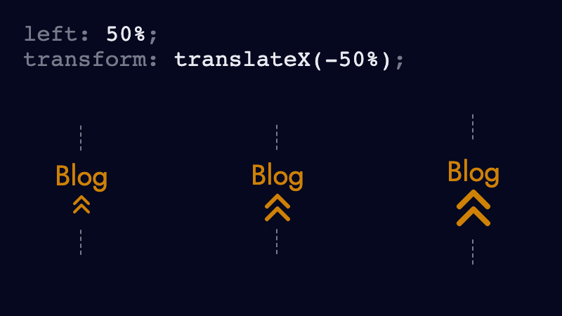
left: 50% moves the left side of the SVG to the center of its parent (the anchor). And translateX(-50%) shifts the SVG leftwards by half of its width (SVG width / 2).
Accessibility #
To be accessible the inline SVG needed a couple of things.
Firstly the icon is hidden from assistive technologies such as screen readers using the aria-hidden attribute. Otherwise some screen readers announce "group" upon discovering it.
Programming language (abbreviated): html
<svg
  xmlns="http://www.w3.org/2000/svg"
  fill="currentColor"
  width="1em"
  height="1em"
  viewBox="0 0 24 24"
  aria-hidden="true"
  focusable="false"
>
  <!-- ... -->
</svg>
Secondly the SVG should not allow focus. Using focusable="false" prevents a second tab stop in Internet Explorer, which if permitted would be both unintuitive and undesirable.
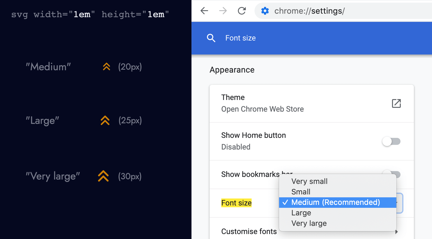
Thirdly the SVG width and height use ems instead of pixels. Ems are relative units which allow the icon size to scale proportionality to the current/parent element, or user-defined font-size (whereas pixels don't).
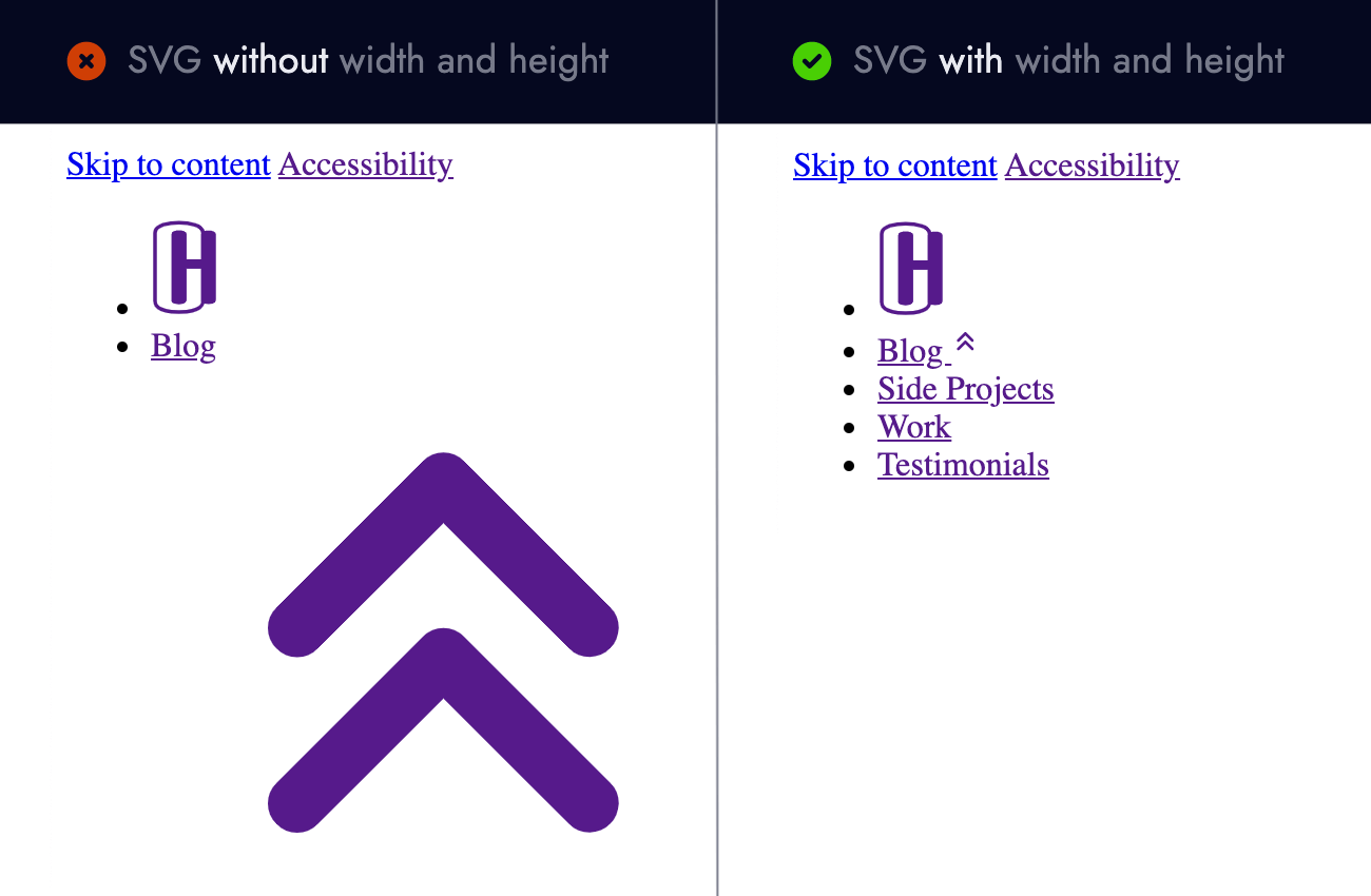
It is important for inline SVGs to have a width and height defined in the HTML. Not doing so (and making CSS responsible for the width/height) is risky since the CSS file could fail to load, resulting in supersized icons.
Fourthly the colour of the icon needs sufficient contrast with the background colour. Tools such as Firefoxes accessibility inspector and WebAims contrast checker can verify the ratio between foreground and background colours.
Lastly you may have noticed the anchor containing the icon has the attribute aria-current="page".
Programming language (abbreviated): html
<a href="/blog/" aria-current="page">
  Blog

  <!-- svg -->
</a>
This allows some screen readers to convey additional context by announcing "Blog, current page link" to indicate (unsurprisingly) what the current page is. Léonie Watson explains using the aria-current attribute in great detail.
And that is a wrap!
To recap #
- Colour alone cannot be used to convey meaning. It should be supplemented with a second visual indicator (such as an icon).
- Before using CSS background images consider any limitations or drawbacks an additional network request incur.
- Using
left: 50%withtransform: translateX(-50%)horizontally centers an element regardless of its size. - Hide presentational SVGs from screen readers using
aria-hidden="true". - Prevent SVG focus in Internet Explorer with
focusable="false". - Relative units (ems) enable SVGs to scale proportionality, unlike pixels.
- Inline SVGs should define their
widthandheightin case CSS fails to load. - Icons should have sufficient colour contrast against their background colour.
- The
aria-currentattribute provides more context to assistive technologies.
About the author
I'm Callum, a Front-end Engineer at Nutmeg. Previously I wrote code for KAYAK, American Express, and Dell. Out of hours I publish blog posts (like this one) and tweet cherry-picks.
Feel free to follow or message me at @_callumhart on Twitter.