Small Wins for Accessibility and Resilience
Providing more context to screen readers and improving default styles.
-
Published
-
Categories
I recently made a small change to the HTML used to render groups of articles throughout this site. Each article has a title, link, and contextual information such as publication date.
An example is the Latest Articles featured on the homepage:
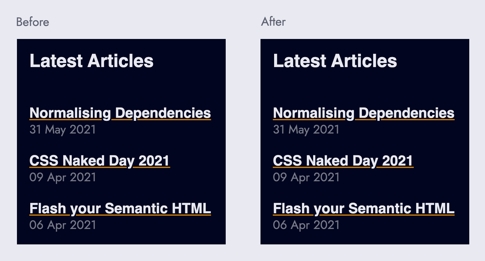
Fear not, this is not a test – there is no visual difference between the before and after screenshot.
The change in HTML structure has not impacted the UI (what you see) in anyway, however from an accessibility and graceful degradation standpoint there is a difference.
Primarily, the newer markup offers a better screen reader experience, and secondly the user-agent styles for when CSS is unavailable is somewhat improved.
Lets look at the original HTML markup:
Programming language (abbreviated): html
<h2>Latest Articles</h2>
<div class="[ cluster ]">
  <article class="[ crop ]">
    <h3>
      <a href="/blog/normalising-dependencies/">Normalising Dependencies</a>
    </h3>
    <time datetime="2021-05-31">31 May 2021</time>
  </article>

  <article class="[ crop ]">
    <h3>
      <a href="/blog/css-naked-day-2021/">CSS Naked Day 2021</a>
    </h3>
    <time datetime="2021-04-09">09 Apr 2021</time>
  </article>

  <article class="[ crop ]">
    <h3>
      <a href="/blog/flash-your-semantic-html/">Flash your Semantic HTML</a>
    </h3>
    <time datetime="2021-04-06">06 Apr 2021</time>
  </article>
</div>
Traversing the articles on VoiceOver (the built-in screen reader on Mac) results in the following transcript. Note: between each bullet point I pressed Control + Option + Right Arrow to navigate to the next element.
- heading level 2 Latest Articles
- article
- heading level 3, link, Normalising Dependencies
- the 31st of May 2021
- end of article
- article
- heading level 3, link, CSS Naked Day 2021
- 09 April 2021
- end of article
- article
- heading level 3, link, Flash your Semantic HTML
- 06 April 2021
- end of article
The new HTML markup is:
Programming language (abbreviated): html
<h2>Latest Articles</h2>
<ul class="[ cluster ] ( lsn np )">
  <li class="[ crop ]">
    <h3>
      <a href="/blog/normalising-dependencies/">Normalising Dependencies</a>
    </h3>
    <time datetime="2021-05-31">31 May 2021</time>
  </li>

  <li class="[ crop ]">
    <h3>
      <a href="/blog/css-naked-day-2021/">CSS Naked Day 2021</a>
    </h3>
    <time datetime="2021-04-09">09 Apr 2021</time>
  </li>

  <li class="[ crop ]">
    <h3>
      <a href="/blog/flash-your-semantic-html/">Flash your Semantic HTML</a>
    </h3>
    <time datetime="2021-04-06">06 Apr 2021</time>
  </li>
</ul>
And the new VoiceOver transcript is:
- heading level 2 Latest Articles
- list 3 items
- heading level 3, link, Normalising Dependencies 1 of 3
- the 31st of May 2021
- heading level 3, link, CSS Naked Day 2021 2 of 3
- 09 April 2021
- heading level 3, link, Flash your Semantic HTML 3 of 3
- 06 April 2021
- end of list
Screen Reader Experience: Before and After #
The number of navigational commands (pressing Control + Option + Right Arrow) to traverse the articles dropped from 12 to 7 (a 42% reduction), making navigation quicker.
Context of total number of articles improved from zero context to VoiceOver announcing “list 3 items” upon discovering the ul, setting expectations of how many articles follow.
Positional context went from none to VoiceOver announcing the article title followed by its position in the group, for example: “heading level 3, link, Normalising Dependencies 1 of 3”, reminding users where they are and how many articles are left.
Lastly, context of reaching the end of a group went from no context to VoiceOver announcing “end of list”, preparing users that the next item will be something new.
First Rule of ARIA Use #
Something worth noting is the original HTML markup could have been decorated with aria labels to provide similar context to screen readers.
That however would break the first rule of ARIA:
If you can use a native HTML element or attribute with the semantics and behavior you require already built in, instead of re-purposing an element and adding an ARIA role, state or property to make it accessible, then do so.
User-agent Styles: Before and After #
When CSS is unavailable (i.e: the resource fails to load) the user-agent styles are only as good as our choice of HTML elements.
This can be seen in the content hierarchy before and after the change:
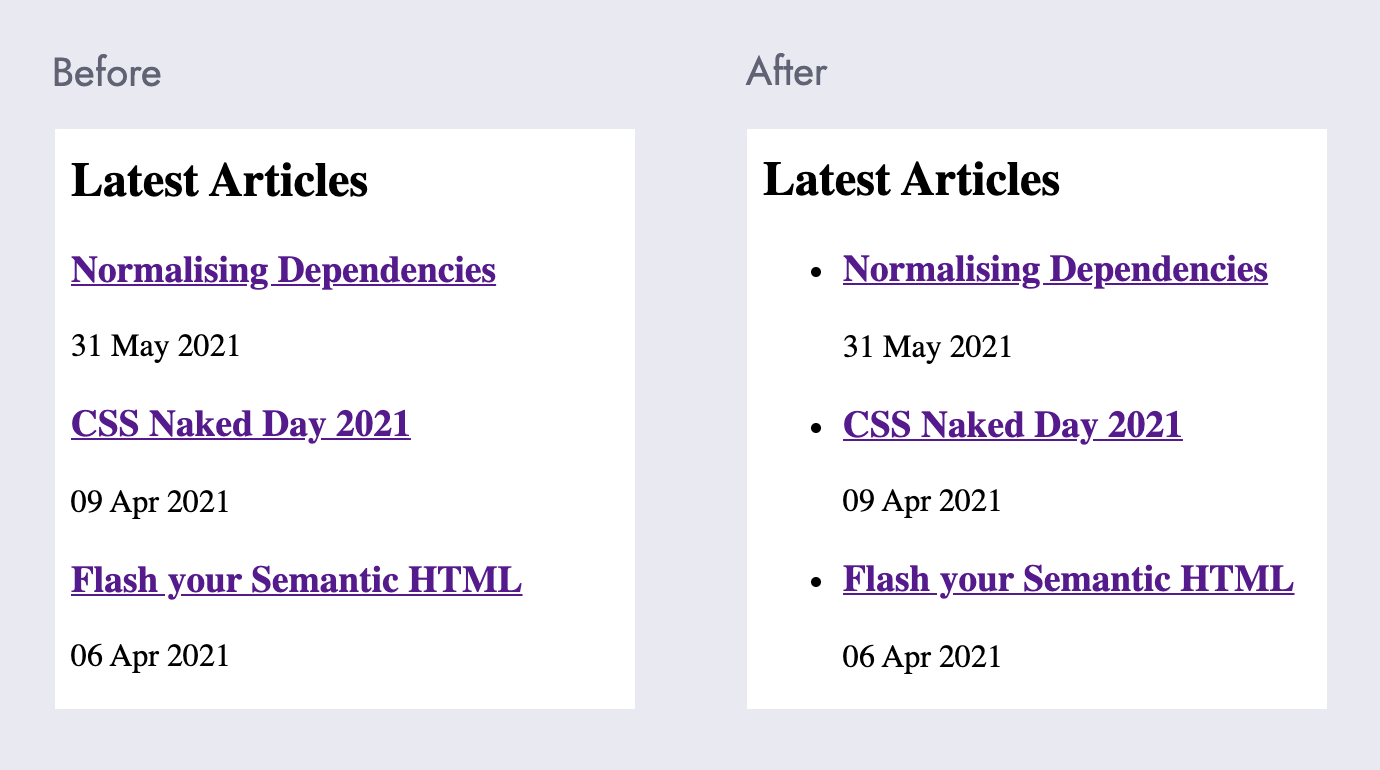
Content hierarchy went from related articles being associated via section headings such as Latest Articles to related articles being grouped by section headings and nesting.
Note to self: if it looks like a list and functions like a list, then it should be a list!
About the author
I'm Callum, a Front-end Engineer at Nutmeg. Previously I wrote code for KAYAK, American Express, and Dell. Out of hours I publish blog posts (like this one) and tweet cherry-picks.
Feel free to follow or message me at @_callumhart on Twitter.