Using Animation to Enhance UX
A deep-dive into how animation can make web interfaces easier to understand with real world examples.
-
Published
-
Categories
Animation has been used very successfully to delight and engage film viewers – I don't need to quote IMDB ratings of Pixar films in order to highlight their popularity. Likewise, used in the right way animation can improve an interface and enhance UX, sometimes even making it magical.
Why does animation improve user experience #
Vision is mankind's primary sense. Throughout history, it has been the main way we found food and avoided predators. We may not need to worry about sabretooths anymore, but our reliance on eyesight remains: colours can repel or attract us, movement catches our attention.
Vision helps make sense of the world around us, which means animated films can be more understandable and appealing than reality. This is because they are manipulated to direct the viewer's attention, aid their understanding, and target their emotions. Every scene is planned, designed, reviewed and tested.
In much the same way, web animation can be used to enhance UX, it's one of my favorite ways to make an interface more understandable. This in turn makes UIs easier and more pleasing to use. The easier it is – the less number of support queries. The more pleasing it is – the more people will keep using it.
It is important to note a key difference between film and web animation. Films have a simple purpose: entertainment. The web is more complex. Users log on to get information, achieve a task or communicate with others. Creator's intent depends on what the "product" is: CRM's retain customers through helping users get stuff done, marketers capture emails through engaging content.
What can animation do for user experience #
As defined in Kit Oliynyk's excellent article, there are three types of web animation: Functional, Material, and Delightful. All three play their own part in UX.
Functional #
- Explain what is happening. Interfaces without animation are like a flip-book with only the first and last page. Animation fills in the gaps between an action and its consequence. This makes UIs more trustworthy, which boosts user confidence.
- Increase perceived speed. Introducing motion can distract users from waiting time – making them think they're not waiting for something (even when they are).
- Provide visual feedback. Animation can acknowledge that an action has happened, is happening, or will happen. These responsive interfaces are reassuring.
- Guide users. Animation can walk users through a sequence of steps. This allows users to anticipate things that will happen in the future.
Material #
- Add spatial awareness. Movement provides a way to introduce users to their surroundings, and more importantly how to navigate around them.
- Provide more context. The mechanics of an animation should reflect the use case. Movement can manage a user's expectation – slide up to open, slide down to close.
- Make interfaces feel real. Consistency isn't just restricted to colour schemes – when objects move and behave on screen like they do in real life they are more relatable. A more believable UI provides a more genuine experience.
Delightful #
- Entertain users. Animation can transform boring interactions into something much more enjoyable.
- Add polish and sophistication. Animation shouts quality, and being easy on the eye goes a long way when a system is used day in day out. This in turn can boost sales and reduce churn – I've seen this happen.
- Establish brand identity. Animation can add personality to an interface, it is this personality that helps drive brand awareness.
A word of caution: don't over-animate #
Not every film is animated – it is normally just a handful a year. I can think of three reasons for this:
- Most films wouldn't work as cartoons. Would 'American Gangster' have the same allure if Denzel Washington was replaced by a cartoon?
- They are technically difficult to pull off. Talent is a constraint too – I'll stick my head out and say there are more actors than animators in the world.
- Filmmakers want to avoid saturating the market. The relative rarity of animated movies makes them more special to viewers.
Like in film, web animations should not be used excessively. If it isn't functional, material or delightful it is probably not needed. Excessive use can slow interactions where speed is a priority, distract users, and numb users to the effects of purposeful animations.
Real world examples #
Finally, some examples! As the subtitle implies I don't work for Disney :( so apologies if you hoped to see a sneak peak of Finding Dory 2. However, I can share some animations I designed and built for a CRM called CommuSoft.
I used CSS3 animation, a smidgen of JavaScript, and a tonne of CSS transitions in them. Please note these are screen recordings from the live system.
The first five examples are primarily functional and material animations. So without further ado.
What goes up must come down #
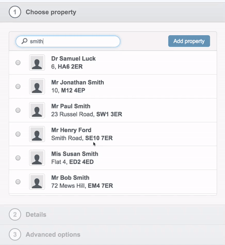
Animation is used to compensate for the validations enforced by the accordion. For example, "details" can only be opened when a property is selected (in "choose property").
The animation directs the user's attention to the section of the accordion that they can fill out. This keeps the user's focus relevant, whilst minimizing the chances of getting lost.
The movement is natural and adheres to physics. When you click a property, it is moved from where it is to where it needs to go, and the reverse happens when it's put back again.
Polish is added by combining the sliding and blurring transitions – animations working in tandem are more pleasing than if each occur separately. This is something called "overlapping action" and I highly recommend checking out Pasquale D'Silva's video Designing with animation on this.
Educating users on why and how an outcome exists #
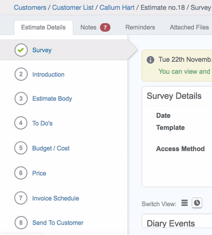
This teaches users what happens when they convert an estimate from having one job to multiple jobs.
The conversion has a big impact on the UI. Some of the menu items (on the left) are moved into a completely new section of the estimate (called "options"). This is a difficult change to comprehend, especially for first-time users, and even more so if it happens instantly (i.e. without animation).
The animation demonstrates how estimates with one job differ from estimates with multiple jobs. The user learns what "options" is and what menu items live in it. Not only does this help a user's understanding immediately, it prepares them for the next time they encounter an estimate with multiple jobs.
It also incorporates meaningful help text at different stages of the animation, which reinforces "something is happening, sit tight, you can trust us". Polish is added using scale transform to swap icons (number, loading gif and tick).
Mimicking a server-side process #
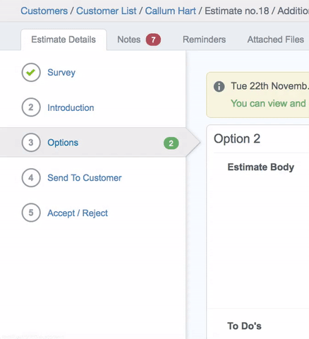
This is the reverse of the animation above.
It mimics a process that's happening behind the scenes. Converting an estimate from having multiple jobs to one job takes a matter of milliseconds on the server. However, the workflow is quite complicated and the consequences difficult to recognize.
The animation draws the user's focus to the left hand menu, so it can explain (visually) why "options" no longer exists, and where the menu items previously in it can be found.
The movement is natural and consistent with the reverse animation, thus providing context and adhering to CommuSofts identity.
Filling in the gaps #
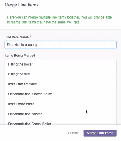
This animation fills in the gaps between merging multiple line items into one.
When the user clicks the "merge" button their intent is acknowledged. The button responds with a loading transition whilst the top line item flips outwards, as if it were on a hinge, to allow the items below to slide up into it.
Realism is achieved by the speed in which the line items move. The further the line item is from the top, the faster it goes – replicating acceleration in real life.
Perceived speed: rapid postcode lookups #
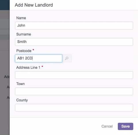
This is used to increase the perceived speed of finding an address with a postcode.
The postcode is sent to the server as soon as the user clicks the "search" icon. However, the rotation adds a few extra milliseconds before showing the loading screen. Stalling the loading screen not only buys time, but it bluffs the user into thinking they are waiting for the rotation to finish, rather than the response from the server.
The animation gives the interface a third dimension. It almost impersonates a waiter taking your order and returning with your food. "Need an address... I'll be right back".
Some extra polished examples #
I have two more examples that mostly adhere to material and delightful types of animation. Both are polished alternatives to something that otherwise would be rather uninteresting.
Playful errors #
This is more playful than purposeful. Who likes it when a web page crashes? Certainly not me.
This UI is intended for 500 errors. Something bad has happened and the chances are there is nothing the user can do about it. The aim of this is therefore to soften the blow that something has gone wrong.
When the error message flips in the momentum pushes the content below it downwards. The momentum replicates how objects collide in reality, i.e., during a collision objects move past their idle state (hence the bounce effect).
This is an example of overlapping events: the error message swings in, the inputs move down, and the button transition all happen simultaneously, which adds a level of sophistication and belief to the animation.
As a side note, the form data is preserved after the error. This is so the user can retrieve the data whilst maintaining context.
Reassuring animation #
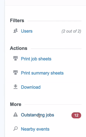
It's quite disconcerting when a view is replaced by another. A certain level of ambiguity exists: "how can I go back? And how can I undo this action?"
The animation adds a delay between switching views (from the side menu to "outstanding jobs"). The delay gives the user enough time to process the change. This is something I'd call a reassuring animation.
Direction plays an important role by drawing the user's attention onto the appropriate content. When "outstanding jobs" opens the user's eyesight is guided to the top of the section (where the filters and search are). Further, it brings focus to the close icon, which hints to the user how to undo the action. When "outstanding jobs" is closed attention is brought back to the side menu.
My favorite part is the transformation between the red label ("12") and the close icon. They do say the devil is in the details!
Easing out #
Animations should justify their existence. I love designing animations and sometimes have to resist the urge to overuse them! Stripe use just the right amount in their designs and clearly put a lot of thought into them. In fact Michaël Villar's article on animation used to improve the Stripe payment experience inspired me to write this.
I may follow up this blog with a coded example – if that is something that would interest you please shout out below with some requests.
Have something to say? Are there any other reasons to use animations? Or any examples you can share? If so, feel free to stick them in a tweet.
P.S. If you liked this post check out one on interface previews (aka skeleton screens) which looks at how perceived speed and user experience are related.
P.P.S. Thanks to Sarah for helping me articulate my thoughts!
About the author
I'm Callum, a Front-end Engineer at Nutmeg. Previously I wrote code for KAYAK, American Express, and Dell. Out of hours I publish blog posts (like this one) and tweet cherry-picks.
Feel free to follow or message me at @_callumhart on Twitter.