Vector based graphics in HTML & CSS
Using CSS pre-processor variables to create scalable HTML elements.
-
Published
-
Categories
Webucator made a short video to accompany this post on YouTube.
A short while back I found a neat solution for making a logo in HTML & CSS and thought I'd share.
What you'll need #
- A CSS preprocessor (LESS, SASS)
- Time and patience!
Whilst designing effortless I couldn't decide what size the logo should be. I wanted to be able to adjust its size at a later point with the least amount of effort (excuse the pun).
Firstly lets look at the anatomy of the logo:
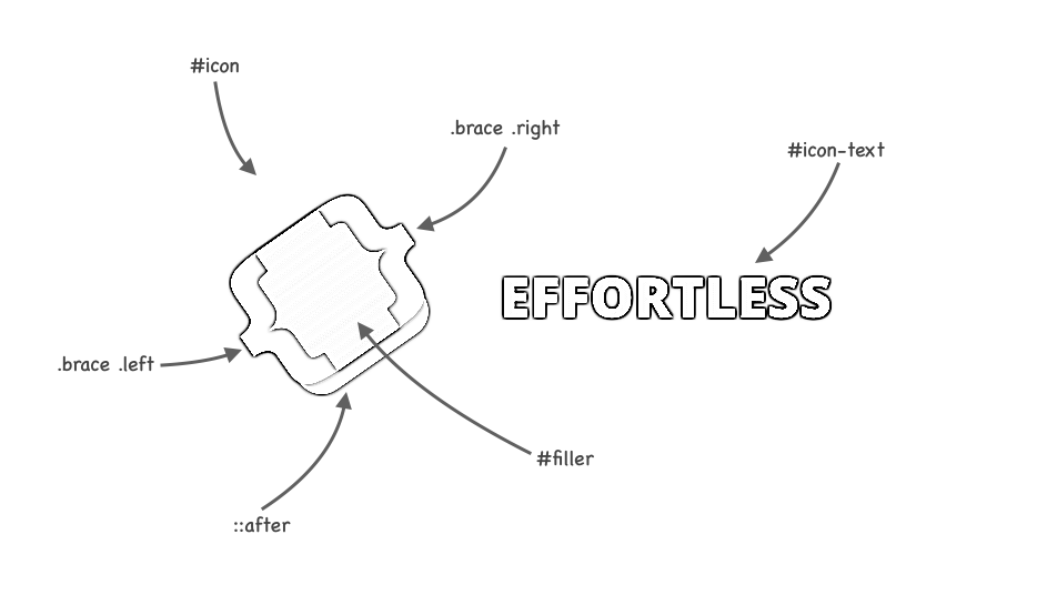
Having built the logo with fixed measurements (i.e. #filler width 31px and #icon font-size 36px) I set about making each property value dynamic.
Multiplying each property value with a variable formed the basis of the vector part.
A variable @dimension was assigned a number and used in every other variable used to make the icon. For example the variable @icon-filler-width was given the value 31px * @dimension and the variable @icon-font-size was assigned 36px * @dimension.
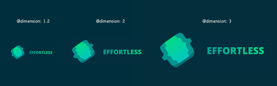
Changing the value of @dimension thus updated the value of any variables that used it (and in turn the size of the logo).
In the wild the variables look like this:
Programming language (abbreviated): less
// Change @dimension value to update the size of the logo
@dimension: 1.2;

// Icon
@icon-font-size: 36px * @dimension;
@icon-shadow-left: 6px * @dimension;
@icon-shadow-top: 40px * @dimension;
@icon-shadow-width: 34px * @dimension;
@icon-shadow-height: 8px * @dimension;
@icon-shadow-radius: 0 0 (6px * @dimension) (6px * @dimension);
@brace-left: 30.5px * @dimension;
@icon-filler-left: 8px * @dimension;
@icon-filler-top: 12px * @dimension;
@icon-filler-width: 31px * @dimension;
@icon-filler-height: 33px * @dimension;
@icon-filler-radius: 10px * @dimension;

// Text (the bit that says "Effortless")
@icon-text-font-size: 12.5px * @dimension;
@icon-text-top: 3px * @dimension;
@icon-text-left: 74px * @dimension;
And are used like so:
Programming language (abbreviated): less
#icon {
  position: absolute;
  .transform(rotate(-35deg));
  font-family: @braces-font-family;
  font-weight: @braces-font-weight;
  font-size: @icon-font-size;

  &:after {
    content: ' ';
    position: absolute;
    top: @icon-shadow-top;
    left: @icon-shadow-left;
    width: @icon-shadow-width;
    height: @icon-shadow-height;
    background: @icon-shadow-color;
    .border-radius(@icon-shadow-radius);
  }

  // Etcetera
}
And voila the end result:
As we're dealing with just HTML & CSS adding animations is a breeze, and graphics made this way are retina friendly straight out the box.
Lastly if you haven't seen them already check out these pure CSS logos built by @bchANx.
About the author
I'm Callum, a Front-end Engineer at Nutmeg. Previously I wrote code for KAYAK, American Express, and Dell. Out of hours I publish blog posts (like this one) and tweet cherry-picks.
Feel free to follow or message me at @_callumhart on Twitter.